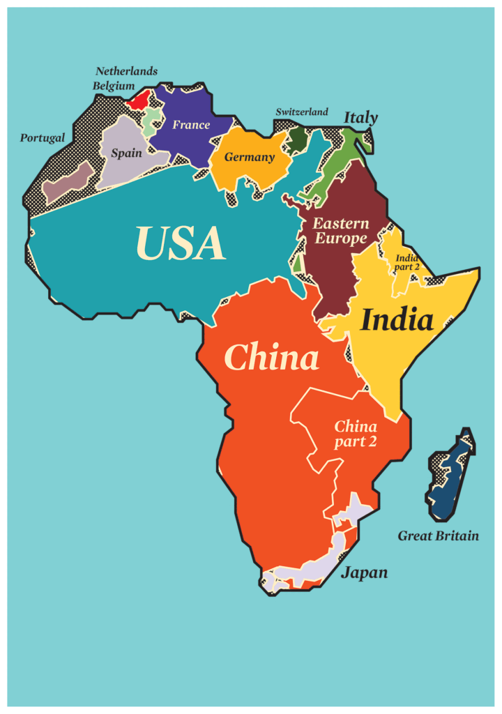
Tag Archives | Infographic

Six trends in innovisualisation

By Inside | Out

The world is changing. And so is the way we use information to assess and describe it. That’s why today’s organisations are looking for more visual data, and today’s infographics speak more than a thousand words. Thomas shares the trends behind the change… [wooslider slider_type=”attachments”] 1 Results count more… In my experience and in many […]

Author

Info + Graphics = Innovisualisation

By Thomas Scalway

Infographics are not just pretty pictures. The good ones, that is. They are new and innovative ways of presenting information in an increasingly visual and results orientated world. We call it “innovisualisation”. Here’s why your data needs it now.


Inside | Thomas Scalway

Thomas_ScalwayHe’s a consultant, specialising in strategy and evaluation for public health. For more than 15 years, he’s worked with governments and UN organisations on how to use data strategically to shape or evaluate what they do. Now he has an agency called Lushomo, which finds creative ways to present and share strategic information, mainly through infographics. Lushomo means “courage” in Tonga. It’s also the name
of Thomas’ boat.

Author

Here’s How it Starts

By Francois Bonnici

Social impact is always more impactful when it works from the inside out. In other words, from within the environment, community or social challenge that it’s seeking to address. Creating an innovation, business or organisation that achieves this end has to start with the right kind of thinking. This means thinking about the problem from […]


Inside | Francois Bonnici

Francois_Bonnici

Francois Bonnici is the editorial director of Inside | Out and the co-founder and director of Bertha Centre for Social Innovation and Entrepreneurship at the Graduate School of Business, University of Cape Town. He originally trained as a medical doctor, graduating top of his class. He then read for a Masters in Public Health (London) and an MBA on a Rhodes Scholarship at Oxford’s Said Business School, where he received the prize for the best overall MBA student. He has a Masters in Global Leadership conferred by the World Economic Forum and is the Head of Africa for the Schwab Foundation for Social Entrepreneurship.

Author

The true size of Africa

By Inside | Out

In a bid to fight “immappancy” and chronic misjudgement of Africa’s true scale, software and computer – graphics guru Kai Krause created a public domain image that illustrates the truth. The continent is bigger than the USA, UK, Japan, China, India and the whole of Europe. All combined. No wonder there’s so much potential…

Author